Responsive design is a website designing approach that enables the layout of a website to dynamically adjust based on the device it is viewed or accessed on. Although responsive design is a broad concept with many facets, there are three fundamental elements of it which are fluid grid system, flexible images and media queries. However it is important to view it as a comprehensive approach that is inclusive of multiple interconnected elements. With the prominence of mobile users across the globe and Google favouring it, responsive design is much in talks. Let’s understand how it works and whether it’s useful in boosting ranking and user experience or is overrated. Along with this, we will discuss what aspects to consider to create a responsive website.
Let’s begin!
What is Responsive Design?
In simple words, responsive design is a method to build a website so that it can automatically scale its elements and content to match different screen dimensions. Having a responsive design means giving your visitors a seamless view without having to zoom out or zoom in to read the content and use the functionality flawlessly. Doesn’t this sound like something that can reduce the bounce rate considerably? Well, if you are thinking this way, you’re absolutely right. Responsive design is a critical investment as it saves you valuable time and money. Having responsive design, you no longer need dedicated mobile design.
Why Responsive Design?
Did you know that at the end of 2021, mobile devices generated 54.4% of global website traffic? This tells responsive website design is no longer a suggestion but a necessity. With responsive design, you can significantly improve the user experience, create content that is actually useful, and reach a broader audience. 50% of smartphone users are more likely to use a business or company’s mobile site when browsing or shopping because they don’t want to download the app, indicating a strong preference for mobile websites over mobile apps among smartphone users.
You Can Create a Mobile First Design
Responsive design and mobile-first design are closely related as they both ensure a website adapts to different screen sizes. This is the core functionality of both approaches. They use techniques like flexible layouts, media queries, and fluid images to make the website usable on desktops, tablets, and mobiles. Both responsive and mobile-first designs aim to make the website easy and enjoyable to use regardless of the device.
A design approach that makes web pages render well on a variety of devices and screen sizes. It involves using flexible grids, images, and CSS media queries.
Why Responsive Design Often Means Mobile-First
Responsive designs make sure that a website adapts itself to different screen sizes, from small smartphones to large desktops. Though in itself, it doesn’t demand a mobile-first approach, it is very closely related because of the following reasons:
- Dominance of Mobile Devices
Reasons why there is dominance of mobile devices:
- Smartphones and tablets are fast becoming the most used access points to the internet. In 2021, there were 7.1 billion mobile users globally, with projections indicating an increase to 7.26 billion by 2022.
- People are using mobiles increasingly to search, shop, and engage with others.
- Google penalizes websites which are not mobile-friendly in search results.
- Design Constraints
Designing for mobile devices comes with a host of design constraints inherently, which makes a case for a mobile-first approach. Mobile screens are small, and this forces the designer to keep only the most important information and develop blatant navigation. Mobile interactions are touch-based, requiring large buttons and touch-friendly elements in the design. In addition, mobile networks are generally slower, making a case for effective design and image compression for responsive performance.
- Scalability and Efficiency
A mobile-first design gives great grounding to scale up seamlessly into larger screens. For example, beginning with a mobile-first approach mainly helps designers set up the core content and functionality, which could then be built on for bigger displays. Designing for mobile first enables the identification of priorities in information and features. Further, most problems that will be found on mobile will point out bigger problems on larger screens, so this would, therefore, streamline testing and optimization.
- User Experience
Mobile-first approaches tend to improve the user experience on any device. Given that a mobile-first approach prioritizes important content and uncluttered interfaces, it significantly enhances the experience for all users. This focus on mobile accessibility also benefits people with disabilities when using a website on any device.
While responsive design deals with adaptable layouts, generally a mobile-first approach yields a better overall user experience. It makes sure that core functionalities and content are effective and accessible on the most constrained devices, setting a robust base for a responsive website.
But let’s not forget that not all websites may justify the need to have a first mobile approach. If your target audience uses desktops as the main device, then it would be more apt to have a desktop-first approach.
Responsive designs are not necessarily going to hold up to all of the rules of mobile-first. The idea is to provide flexibility within the structures so that they work best on any screen size.
Keeping these factors in mind, you will be quite capable of deciding whether to use a mobile-first or desktop-first approach for any given project.
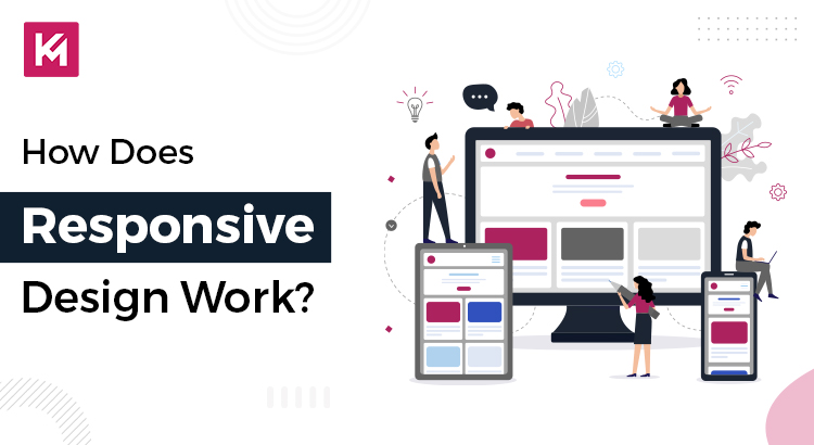
How Responsive Website Design Works
Responsive web design is a method that enables websites to adjust their layout and content according to the screen size of the device being used. This approach ensures an optimal viewing experience across a range of devices, including desktops, laptops, tablets, and smartphones.
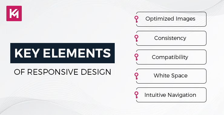
Core Components of Responsive Design
Fluid Grid Layout
Responsive designs employ fluid grids rather than fixed-width layouts. Fluid grids are designed to expand or contract based on the screen size, ensuring that website elements scale proportionally. This approach helps maintain the overall structure and balance of the website, regardless of the device being used.
Flexible Images and Media
Images and other media elements are optimized to adjust their size and format according to the device. This flexibility prevents image distortion and reduces slow loading times on smaller screens, contributing to a smoother user experience.
CSS Media Queries
At the core of responsive design are CSS media queries, which allow for the application of specific styles based on different screen sizes, orientations, and device characteristics. Media queries enable designers to hide certain elements on smaller screens, adjust font sizes, or rearrange the content layout, tailoring the presentation to the device’s capabilities.
How it Works
Detecting Device
When a user accesses a website, the browser first determines the device’s screen size, orientation, and other relevant attributes. This information is crucial for applying the appropriate responsive design techniques.
Applying Styles
Based on the detected device information, the browser applies CSS styles defined by media queries. These styles dictate how the website should appear and function on the specific device, ensuring that it is both aesthetically pleasing and functional.
Adjusting Layout and Content
The website’s layout and content elements dynamically adjust to fit the screen size. This may involve rearranging elements, hiding or showing content, changing font sizes, and optimizing images to ensure a cohesive and efficient presentation across all devices.
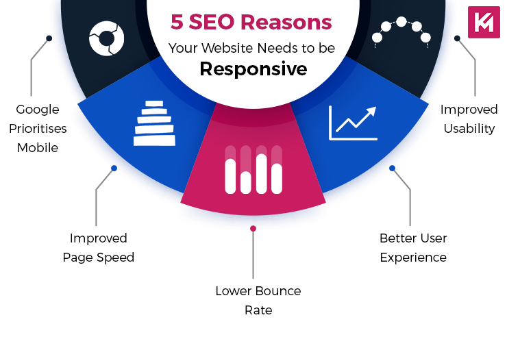
Is Responsive Design A Ranking Factor?
Although Google has made it clear many times that it prefers responsive websites, the question is whether it is a ranking factor. Following are some more arguments experts have made:
Mobile-first indexing
Even though it’s not directly related to responsive design, the fact that Google moved to mobile-first indexing is a proof that it cares about a good mobile experience. Responsive design typically ensures a better mobile experience.
User Experience
Realistically, the user experience is something that Google prioritizes. Responsive design tends to foster enhanced user experiences across devices, which indirectly may influence rankings.
Core Web Vitals
These ranking factors-based metrics are much easier to hit on responsive sites, with their easier codebase and potential for optimization.
While Google has not openly declared responsive design as a ranking factor, it is quite likely that indirectly, through its impact on user experience, mobile-first indexing, and Core Web Vitals, this change ends up impacting rankings.
Wrapping Up
Responsive design is essential for modern websites. With the majority of internet users accessing content through mobile devices, creating a smooth and easily accessible experience across all screen sizes is no longer an option but a necessity. By investing in responsive design, website owners can enhance user experience, boost engagement, and save valuable time and resources in the long run.